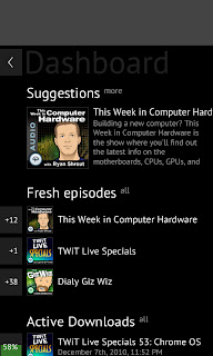
Andrew Zhilin has been creating awesome mock-ups for the last few months for gPodder's new QML UI. Back in December 2010, Andrew started with the first mock-ups based on the screenshots from meego.com:
After that, we decided to go a step further and make it look even more futuristic (this was partly inspired by Metro - two months before #feb11). Most of the title bar and podcast list design have been kept (although evolved) in the current design. This is also the first time that Andrew integrated the playback feature into the mock-ups - a player "widget" that can be pulled down. In the current version, it's still a widget that can be brought in with a tab, but it's placed on the bottom:
And here are two more of these rare mock-ups - the first one was a suggestion for the main menu (something which we don't have at the moment - the "main view" in gPodder/QML currently is the podcast list, with buttons in the title bar for more actions). The second one is also a very unique design in my opinion - I especially like the vertical progress bars, and the slick black-and-gray color tones. The gray rectangle at the top of the second mock-up was just a placeholder for the window manager's title bar:
Stay tuned for more mock-ups by your favorite Russian designer in the second part. Also, the real implementation of gPodder/QML is progressing nicely. Expect some additional updates on this in the next days, too :)
Subscribe to:
Post Comments (Atom)


No comments:
Post a Comment