Thursday, September 29, 2011
gPodder Maemo 5 Remota Usability Test Videos
Sunday, August 7, 2011
gPodder QML Mock-ups by wazd, part 2
Next up are two more of these green-ish mock-ups, where one has a different style of playback control buttons for the audio player widget, and the other one is an example of how the settings view could look like in the new style (again, this was before any of the Harmattan UI style guidelines have been published, so the design is very unique and doesn't take into account the availability of Qt Components yet):
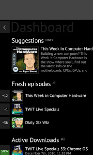
And finally, here is a mock-up of a possible "Summary" view, summarizing what's new and also suggesting some new podcasts that might be interesting for you, based on existing subscriptions. This is not implemented yet, but it could be added at some point with a more deeper integration with gpodder.net, which already provides podcast suggestions and a tag-based podcast directory:

Thanks for your interest, and stay tuned for some updates regarding gPodder itself (for N8x0 users, N900 users and N950/N9 users as well) in the next days!
Wednesday, August 3, 2011
gPodder QML Mock-ups by wazd, part 1
After that, we decided to go a step further and make it look even more futuristic (this was partly inspired by Metro - two months before #feb11). Most of the title bar and podcast list design have been kept (although evolved) in the current design. This is also the first time that Andrew integrated the playback feature into the mock-ups - a player "widget" that can be pulled down. In the current version, it's still a widget that can be brought in with a tab, but it's placed on the bottom:
And here are two more of these rare mock-ups - the first one was a suggestion for the main menu (something which we don't have at the moment - the "main view" in gPodder/QML currently is the podcast list, with buttons in the title bar for more actions). The second one is also a very unique design in my opinion - I especially like the vertical progress bars, and the slick black-and-gray color tones. The gray rectangle at the top of the second mock-up was just a placeholder for the window manager's title bar:
Stay tuned for more mock-ups by your favorite Russian designer in the second part. Also, the real implementation of gPodder/QML is progressing nicely. Expect some additional updates on this in the next days, too :)
Friday, November 26, 2010
Maemo 5 app UIs: {The,A} big picture
Sooner or later it will be necessary to create a QML UI for gPodder if it is to integrate nicely with devices on which Qt is the "native" toolkit for third party apps. At the moment, the reusable UI elements that can be used with QML (Qt Components) have not yet been officially released (the Git repository is available on Gitorious, though), and there are no UI style guidelines for Harmattan out (yet?). I'm also not able to locate UI style guidelines for QML apps on Symbian^3, and there are only a few small sample QML apps out right now.
Let's look at what we have on Maemo 5 right now. Here's a simplified overview of the current Maemo 5 UI of gPodder:
You can also check out the full-size image (~ 3.5 MB).
The UI follows the Maemo 5 Style Guide where it makes sense and tries to come up with better solutions where the Style Guide does not have a definitive answer. I'd like to hear your opinion about the current UX of gPodder and how these concepts can be translated into a QML app that integrates nicely with "future" UIs (Harmattan, S^3). The new-style episode list that can be seen in this picture will be made available with the next release that will be out Really Soon Now™.
Monday, October 11, 2010
gPodder 2.9 for Maemo 5 in Testing
A new release of gPodder is out. Test it and vote! It has got some fine-tuning of the UI for Maemo 5 users that you will discover one by one. I just want to highlight two UI changes that should enhance the user experience, and compare them to what the previous version had.
The episode list
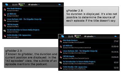
gPodder 2.8 introduced MAFW integration, and with it came the ability to save position and duration information for each episode. This was displayed in the episode action dialog, but not in the episode list. We now display the position and duration in the episode list, which allows you to quickly scan for an episode depending on its duration (or check how far you have come for a given episode). In the "All Episodes" list, we also display the podcast name for each episode so that it is clearer from which podcast an episode is coming (the content of the episode "Mini Book Reviews" is much more predictable if you know that it comes from "Python411").
Updating feeds
Previous versions of gPodder changed the "Check for updates" button into a combined progress indicator and cancel button. It was not really obvious to first-time users that you can cancel the feed update, and if you accidentally tapped the button twice, the feed update would be cancelled and you might be confused. gPodder 2.9 introduces a fancy new progress bar that appears (and even slides in and out thanks to hildon.AnimationActor) during the update and has a more obvious red cancel button. With the gained screen space (the progress bar is much bigger), we can also show more information about the update process, like the name of the updated podcast.
A detailed changelog can be found at http://gpodder.org/changelog/2.9. Of course, the Maemo 4 (N800, N810) package has also been updated, and is available from Diablo Extras right now.
Sunday, May 23, 2010
gPodder 2.6 for Maemo 5: A visual tour
gPodder 2.6 (an app for Maemo that can subscribe to and download podcasts, YouTube videos and tracks from Soundcloud) has been released today. The package is in Extras-Testing, so please test it and vote for it! A package for Diablo (Maemo 4, N8x0) is also available already, and includes some Diablo-specific fixes (the "New episodes available" selection was broken, but works correctly now).
I've prepared some screenshots to compare the UI of gPodder 2.5 for Fremantle with the UI of gPodder 2.6. Here are a few examples:

The episode actions dialog now has a dedicated "Delete" button for downloaded episodes

The settings dialog has proper "Save" semantics now (close the dialog to discard changes, click on "Save" to apply changes) - this has been suggested during UX-Week 1

The progress bar for the episode list has rounded corners (useless, but looks better)
Another feature that isn't visible at first: If you get "New episodes available", and you can't decide from the title of an episode if it's worth downloading, just long-tap the episode and choose "Shownotes" from the context menu to display the complete shownotes in a window.
This release includes improved gpodder.net support (easier configuration, restoring of subscriptions now works on first run), and will feature more fine-grained episode playback status synchronization with the (yet-to-be-released) new version of Panucci.
Wednesday, December 23, 2009
gPodder "after 2.1" Maemo 5 UI Changes (#maebar)
Quick note about the stable version: Thanks to the hard-working testers, gPodder 2.1 has received its necessary karma points in Extras-Testing before the quarantime time is up, so we are just waiting for some more days to pass before gPodder 2.1 will finally enter the Extras repository.
In the mean time, there have been some important developments in the Git repository, mostly based on ideas from the Barcelona Long Weekend - thanks to all the people who provided valuable input, especially Tuomas (tigert) for all the hard work. I have created a new set on Flickr with some screenshots of the current development version:
The new UI is not set in stone, and still has some rough edges, so I'd like to receive some feedback on what can be improved.
If you want to test the development version interactively, use Git to checkout git://repo.or.cz/gpodder.git on your device, and then run bin/gpodder --fremantle --verbose inside the checkout to start the development version in debugging mode. Make sure to have the current version of gPodder installed to drag in the required dependencies (alternatively, install the dependencies by hand). As with all development versions, if it breaks (or messes with your downloads/subscriptions), you got to keep the pieces.
Thanks in advance for the feedback :)
Thursday, September 17, 2009
gPodder 2.0 for Diablo is here + Fremantle progress
A new version of gPodder (2.0; "Day of the Tentacle") was released a few days ago, and it has already landed in Extras for both Chinook and Diablo. I wrote about the Maemo 4 UI changes some weeks ago, and you can enjoy them all on your tablets right now.
Tuomas Kuosmanen (tigert) has suggested some UI improvements for the Fremantle version of gPodder, and I'm currently working on implementing those ideas. First of all, there's an all-new front page:
The podcast directory (which allows you to discover new podcasts) which looked ugly previously has also been "Fremantleized", and is very usable now:
I'm still thinking about the best way to implement indicators for new, downloaded and listened episodes, but at least the GtkPaned-based split view is gone now:
The episode list is also quite unspectacular, but you can use the AppMenu to unsubscribe from the podcast (splitting up the UI in so many views automatically makes the AppMenus not so filled - good move!).
You can find some more screenshots depicting the current status of the UI in this Flickr photoset, and expect a new release next week or so.
Tuesday, September 8, 2009
gPodder on Maemo 4 gets a facelift
I finally got around to redesign parts of the dialogs in gPodder for Maemo 4, because some dialogs were still not really finger-friendly and usable. It's still a work-in-progress, but it looks really slick already and the whole UI is completely finger-friendly.
Let me show you some highlights (gPodder 0.17.0 is the current version available in Maemo Extras and "some old version" is from April 2008):

Pretty icons and slicker UI for the main window (compared to the same window in gPodder 0.17.0 and some old version).

The updated podcast directory dialog allows easy discovery of new content (compared to the same dialog in gPodder 0.17.0 and some old version).

The new episodes dialog shows more text and has finger-friendly rows (compared to the same dialog in gPodder 0.17.0 and some old version).

You will be able to filter the episode view and only show downloaded or unplayed episodes (a new feature!).
The complete set of screenshots can be found on Flickr.
Tuesday, March 3, 2009
Screenshots of gPodder in Fremantle Alpha SDK
As we all know, the Fremantle Alpha SDK has been released, and it features (at least parts of) the new UI. I downloaded the SDK and tried running gPodder inside it, and wanted to show you some pictures so you get an idea how an unmodified Maemo 4 UI looks on Fremantle:
Some other remarks: It seems that images have inverted color. I don't know if this is just a bug or if it's intended to be. Also, Xephyr sometimes crashes, which seems to be related to Clutter, although I do not really know ;) I expecially like how they managed to move the buttons of GTK Dialogs to the right side and stack them. This is a very good decision for the widescreen display, and it also means that one dialog in gPodder fits the screen nicely in Fremantle now that did not (and still does not - my fault ;) on Maemo 4.
See all screenshots at gPodder on Fremantle Alpha SDK on Flickr


